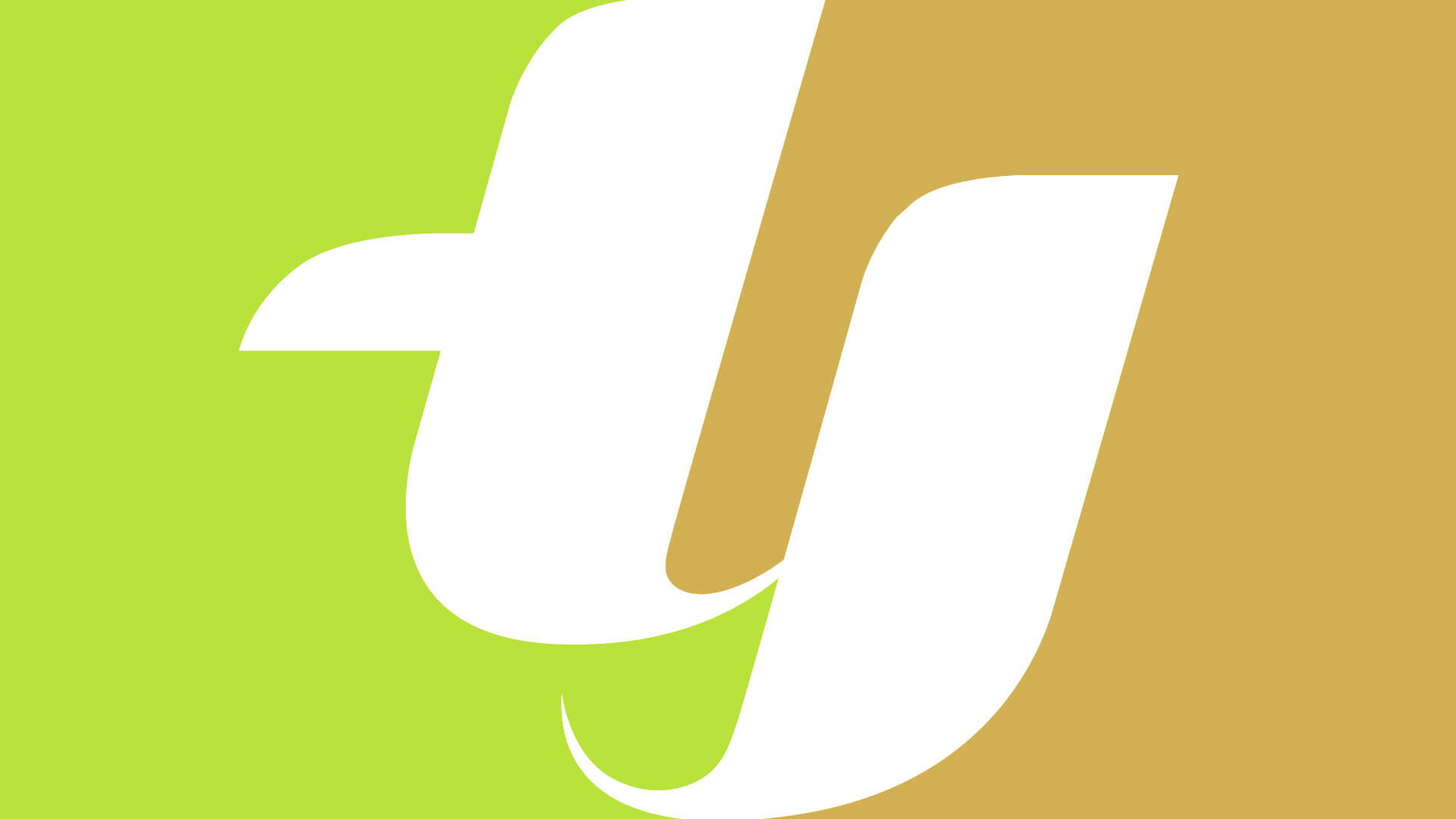
DUALITY, UNITY
As the professional hardwares market becomes more ferocious coupled with ever changing demands from its consumers, TY approached us to refresh thier old logo which has lost its brand relevant and appeal.
After briefed, we all agreed TY needed a visual expression that aptly encapsulated the brand’s new bold, cohesive synergy movement forward.
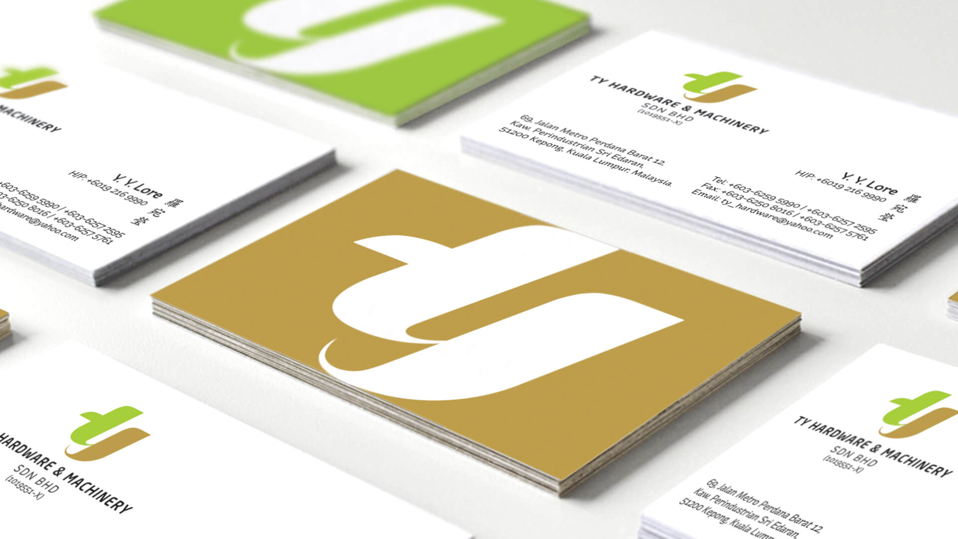
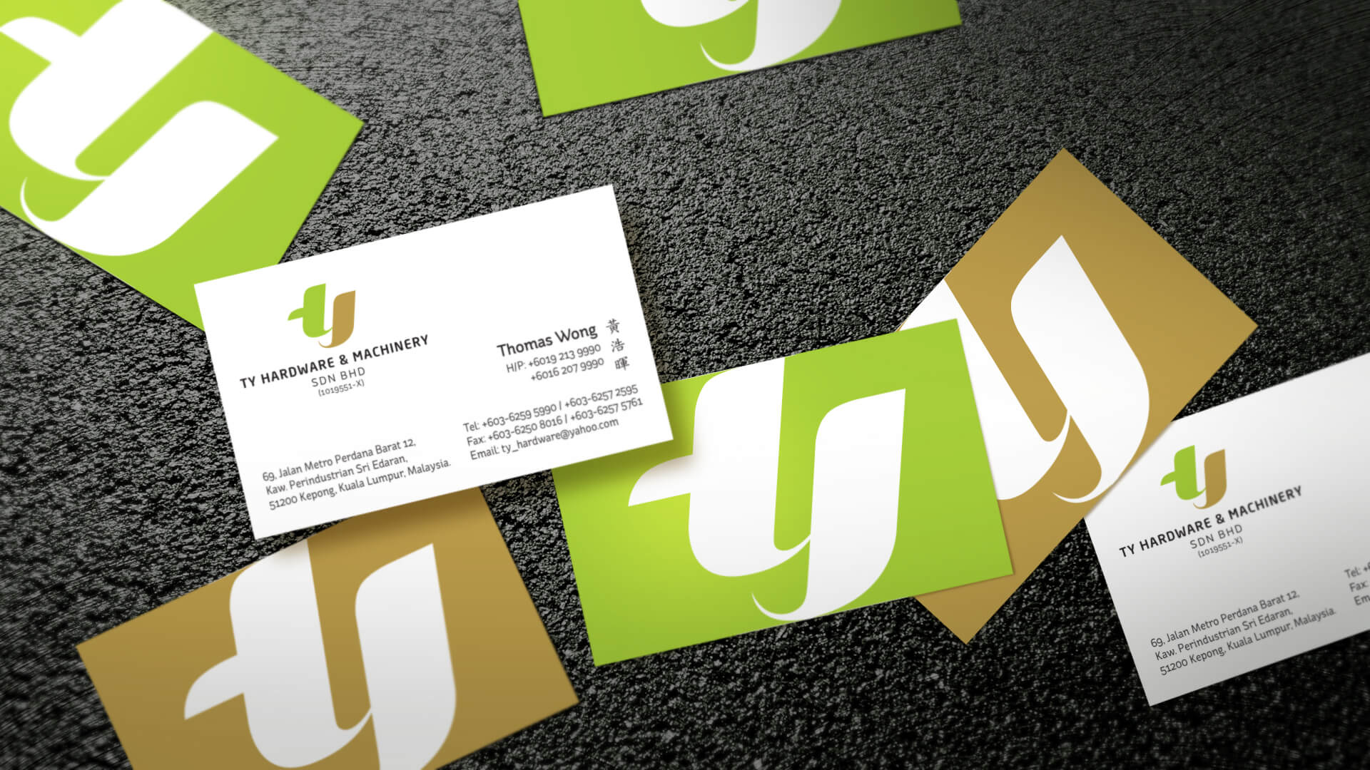
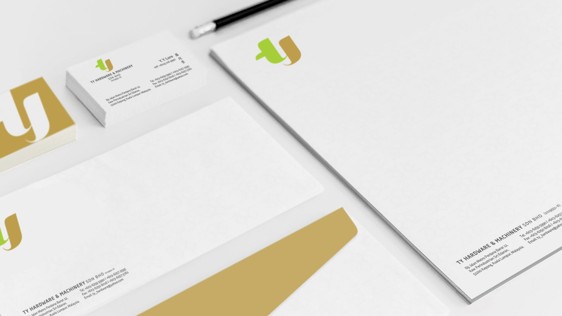
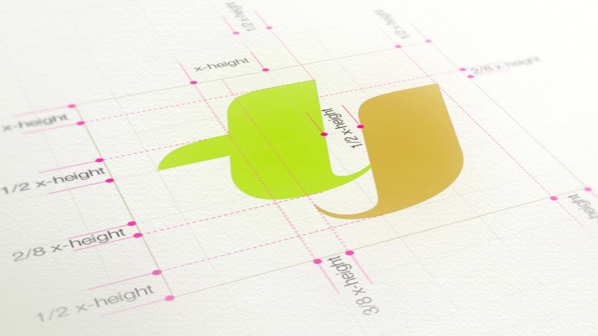
Our new logo is guided by a simple idea, the interlinking letter of the alphabet ‘T’ and ‘Y’ that captures dynamism and cohesive synergy from within. Additionally, it enhances movement and fluidity by embracing new opportunities in approachable appeal.
The result is a visual and symbolic shift representing TY’s new benchmark and confident forward momentum.